01
The Challenge
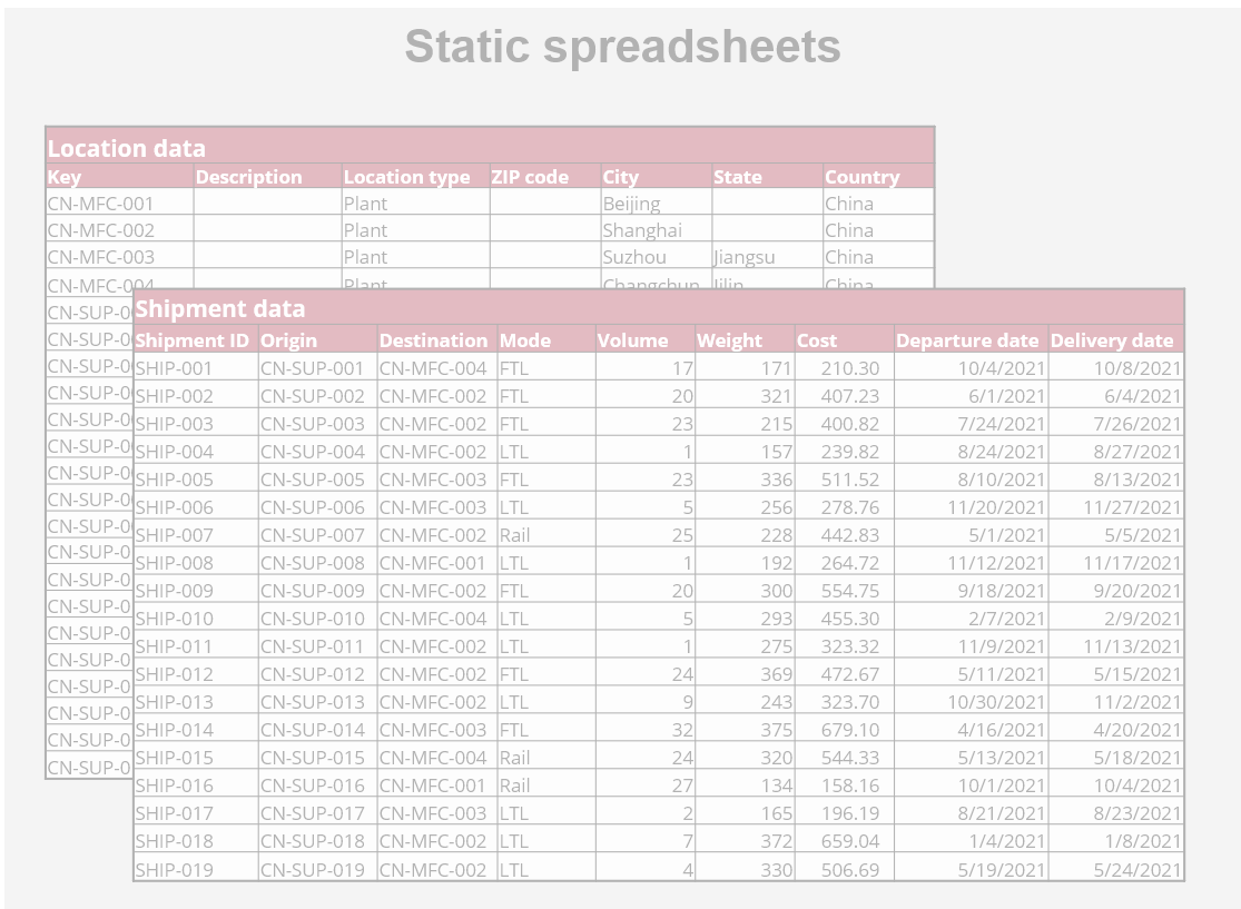
Analysing what happens across a supply chain is cumbersome when transactional data lives in static spreadsheets — limiting visibility, slowing analysis and hiding the patterns that matter.
CAVE LAB · APP SHOWCASE
Turn static supply chain spreadsheets into interactive network visualizations
Analysing what happens across a supply chain is cumbersome when transactional data lives in static spreadsheets — limiting visibility, slowing analysis and hiding the patterns that matter.
The NISCI Network Visualizer transforms location and shipment spreadsheets into interactive dashboards and maps — letting teams visualise and analyse their network intuitively and make better decisions.
Upload location and shipment spreadsheets; the app automatically validates and completes the data, then renders interactive dashboards and maps for network, location and shipment analysis.
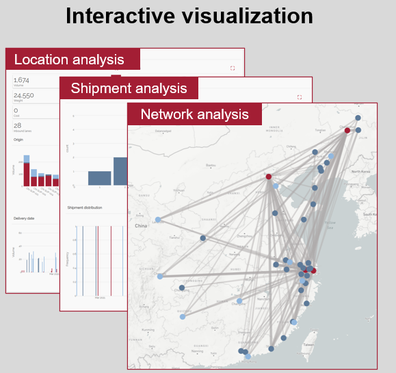
Better decisions start with understanding your data — the Visualizer boosts end-to-end supply chain visibility, runs on any device, and automatically enriches missing data such as distances and carbon-emission estimates.